Showing posts with label person of interest. Show all posts

Saturday, November 26, 2011

Craig Ward


You might remember the Good Typography is Invisible poster by Craig Ward. I looked into the creator and found some other amazing examples of great typography. Craig Ward in his 30 years has become a renowned typographer and so I thought a ‘person of interest’ post was in order.

Craig grew up in an English retirement village, which must have made for a peaceful upbringing, I stayed at a retirement village in Cairns not long ago and we napped every day! He went onto work in advertising agencies as an art director and designer.

He now lives in New York creating award winning typography. Craig has also featured in a number of books including The 3D Type Book, RGB - Reviewing Graphics in Britain and Impressive - Printmaking and Letterpress in Graphic Design

Here are some samples of his beautiful typography. There are quite a few here as I had trouble narrowing down example to include here. I love his ability to inject emotion into the words. Such as in the piece titled 'Love Studies', soft, floating and dreamy or the piece 'Dont Let Go' with hands grabbing adding a feeling of desperation and pleading to stay. You can find more on his website, words are pictures.

You Blow Me Away 
Created for Department for Transport

Don't Let Go

typeface designed by Craig Ward


Love Studies

Wish You Were Here

Thursday, November 24, 2011

Type Posters


These are selected works of Marius Roosendaal, graphic designer and art director from Amersfoort, the Netherlands. It’s times like these that I love having Dutch heritage! Marius committed to doing something creative each day of 2011.
“In most cases this will be some piece of graphic design on a subject that stirs my interests, or simply based on a photograph I've made or found” he says.

I love his use of simple graphics and creative patterns in some posters and then his use of photos and photoshop masks in others. Some even remind me of posters by Josef Muller-Brockmann through his use of simple graphics and grids. And his use of type is always inspired.


Alphabridge

Vertigo

Creativity

Futura

Sunday, November 13, 2011

Type Project #1


After being inspired by Benja Harney and his cover of the October issue of Desktop magazine I decided to try my hand at creating 3D letters out of paper. Working as a self taught paper engineer in Sydney for the last six years, Benja has been involved in many amazing projects with paper including the Parklife poster, Kylie ‘Goddess Edition’ pop-up book and Birds of Tokyo Mastercard advertisement. To see more of Benja’s awesome creations visit Paperform.
Desktop Cover - October

Parklife festival poster


I had always loved the times we made basic 3D shapes in school; cubes, pyramids, cones, even the occasional dodecahedron. We were always provided with a flat piece of paper with a plan marked on it for cuts and folds.

So I decided to start by working out a plan for my letter. I started in Illustrator using the Bauer Bodoni M, thinking about where it would need to join, that the depth would all need to be the same. I thought I would use tape to stick all the pieces together. While putting all the pieces together I remembered that the plans for the cubes, etc had tabs that you would glue so it would fit together. I also realised that I had a few too many pieces to create the depth. As you can see the result here is a little bit shabby.

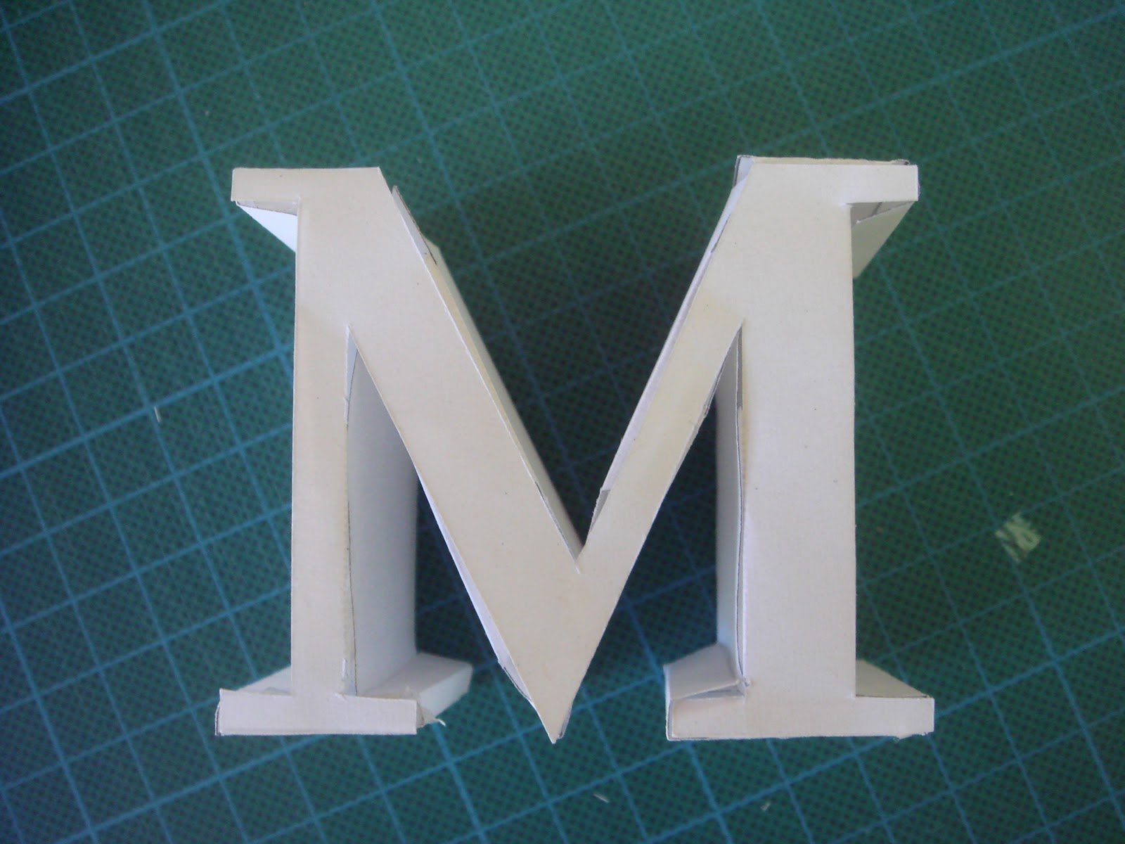
For my second trial I included the much needed tabs and tried to make as many pieces as possible attach to the M. This meant that only folding was needed instead of much cutting and sticky taping. This one is a lot cleaner and was much easier to put together. 
 

Ta Da! Im thinking if I made a few more they would be good hanging from a mobile or strung together like bunting to make a word.